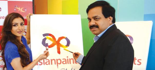
“Consumers have evolved from colour constants to colour forwards,” says Amit Syngle, VPSales & Marketing, Asian Paints. He talks about the insights behind the new brand identity unveiled recently, new brand positioning, game changers for the brand and more
Q] Asian Paints unveiled its new brand identity recently, what were the insights behind this?
We wanted to know how the consumer was reacting to the work done by us in the last 10 years, and the brand personality journey perceived by consumers. The research was spread across 15 odd cities in India by a firm called Centre of Gravity. Some attributes that showed up in the research were very good, including the brand being contemporary, technologically brilliant and creative; and this reflected that we were in line with our strategy. At the same time, it also threw up challenges. Firstly, there were clear things that customers were seeking – as spends on home décor are increasing rapidly, as a brand if we are talking about décor, our thought is to look at it more comprehensively. Secondly, colour has become a very high involvement area for the consumer and the women of the house are becoming increasingly involved in colour decisions. It has now become a family decision with the woman taking the lead. So, colour is a very important zone for us; to make a mark in the future, we need to work in this area. Thirdly, the consumer is looking at an experience rather than a product. So, process involvement needs to be higher. With these three as the large findings of our research, we concluded that we needed to transform ourselves, in terms of the way we look, the way we carve out our future strategy and take care of research challenges presented.
With this background, we needed a visual identity, a symbol to appropriate these values. Our new symbol has a ribbon which stands for décor in a sense, it is led by a spark indicating the transformation it creates in a room, it also stands for vibrancy through colour. Lastly, engaging and partnering consumers by making painting a hassle-free seamless experience is represented by the way ‘a’ and ‘p’ are formed. The symbol signs off on the larger strategy of the brand.
Q] How is the brand positioned post this transformation and new identity?
A brand that inspires décor and partners beautiful homes.
Q] How do you strike the balance between contemporary values as well as retaining trust of older loyal consumers?
The research also showed that while we stand for modern trends, we also stand for being trustworthy; we are not a snooty brand, we are a brand that accommodates all people. As part of our consumer segmentation, we are extremely sensitive to what type of décor each consumer segment is looking at, given their sensibilities. For example, edgy and trendy facets would be targeted to the upper class for our Royale brand, our segmented approach is executed keeping in mind the fact that we do not want to lose the trust that comes from the larger customer base as well.

Q] How does this filter down in the brand communication?
The corporate brand takes on the role of a caring and educating brand and has a larger appeal. People are closer to the brand because it is transparent and wants to teach you more about the process of painting; this is a common thread across all our communication.
Q] What is the strategy used for the brand in Tier II and Tier III cities?
For these cities, we follow the thought process of upgradation - how can we upgrade the consumer from what he or she is using at the moment. Conversion of distemper to emulsion is such an example, giving the consumer value for money and upgrading them.
Q] Can you share marketing initiatives that have proved to be game-changers for the brand?
• We started with small pouches to reach rural consumers effectively and make the product affordable for them. This has been taken up by a lot of FMCG brands.
• Emotional advertising: At a time when every brand was talking about rationale, Asian Paints took a different route and we spoke of ‘apnapan and apna ghar’. The brand started resonating with everybody. Today also, we say our mindshare is far higher than our market-share, and our communication reverberates with consumers as warm and credible.
• We revamped the exteriors market space, which was clouded with cement paints. We changed this by introducing an emulsion for the outdoors; this was the first time any company had done so.
• Entry in the service industry with our home solutions services is a first across the world. If any paint brand was looking at a painting service for the consumer, we started this off in 1999- 2000. Today, we have taken this service across 13 cities.
• How we started looking at colour: India has been a conservative market when it comes to usage of colours. We introduced deep colours very strongly in 2002- 2003, we started communicating to consumers that they could actually experiment with colours and have one dark wall and the other walls light. We started using colour as a great marketing tool.
• Upgrading a trader to a retailer, by revolutionizing the way paint is sold.
Q] What are the current consumer trends in the category today?
It was a category where the consumer was always at a distance. The interactive quotient of the category today has gone up by leaps and bounds. The consumer’s attitude today is that ‘If I am going to paint my house, it is my project’ - from colour constants, consumers have become colour forwards. Earlier, white and ivory were the only colours adorning homes. Now, even smaller homes are not afraid to experiment with colour and texture. Consumers today are seeking an experience rather than a product.
Feedback: priyanka.mehra@exchange4media.com